8 Pastel Color Palettes Inspired by Nature
Pastel color palettes are so pretty to look at ❤. They are soft, dreamy colors that go beyond Easter or a baby’s nursery.
By definition, pastels are tints. You can turn any color into a pastel! Create one by simply mixing enough white into any color to reduce its darkness.
Pastel colors and the color theory behind them
In a previous article I wrote about color theory, I covered how different colors can be interpreted. Now, let’s explore pastel colors a little more closely.
Pastels evoke a sense of peacefulness. Think of a sunset or golden hour, and how that imagery has a soothing effect. Total serenity.
Pastel colors are light, airy, and therefore feel uplifting. Wedding photos have trended towards this looks for a few years now. These days, photo edits look brighter, softer, and less saturated. Here’s an example from Unsplash.
Pastels transcend time. In art history, pastel colors were very much a part of rococo, for example. They have a romantic feel. However, creatives use pastels in a variety of ways and are constantly reinventing the way they’re used. Find new ways to make them yours.
Pastels are earthy and warm. They are perfect for brands that want to communicate that they are natural and organic. Check-out Pigment, a local shop in North Park San Diego. They do such an amazing job with their pastel colors that exist not just on their website, but in their stores as well.
Pastel color palettes are modern. Used in the right way, pastel colors are definitely on trend.
Inspiration
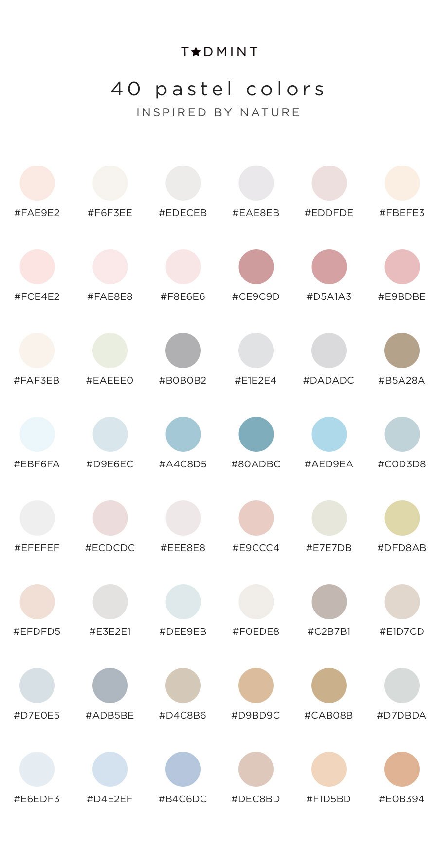
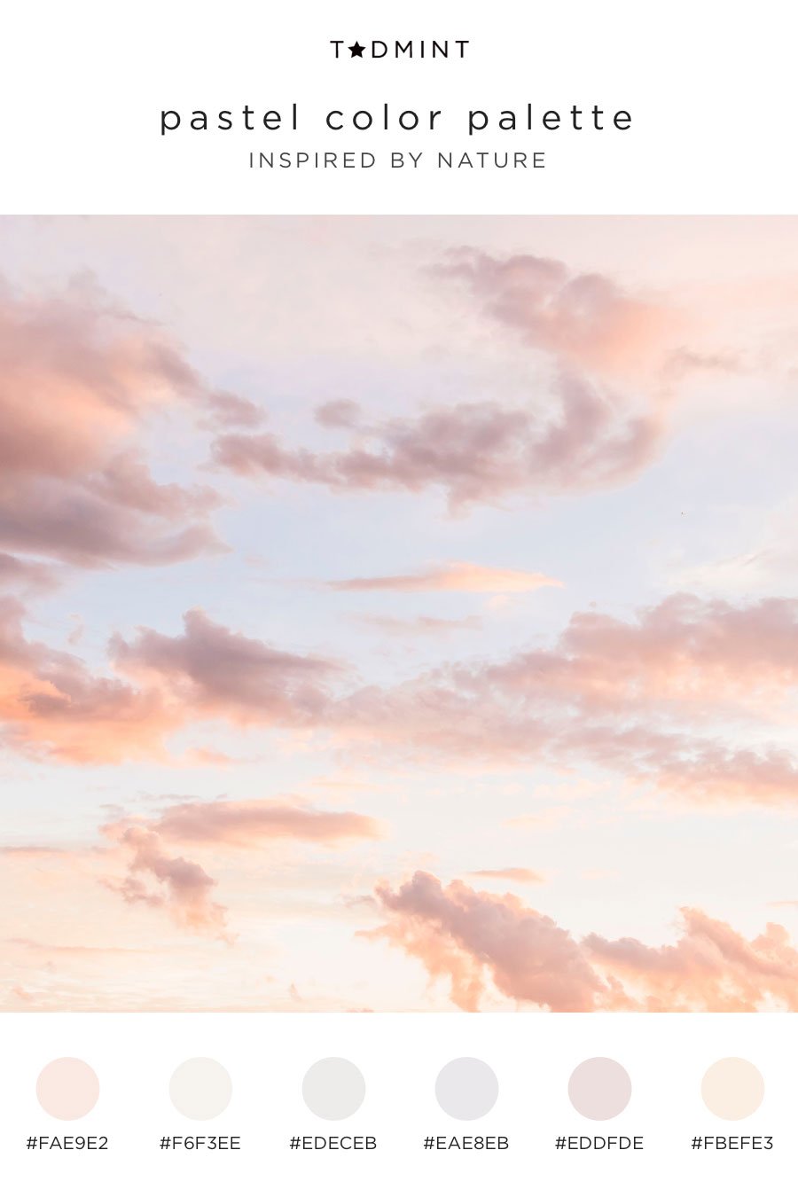
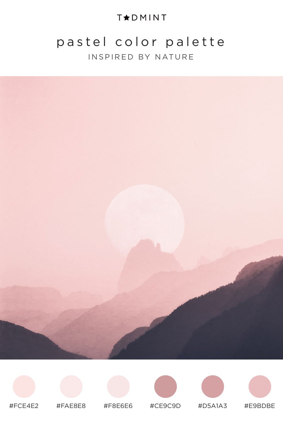
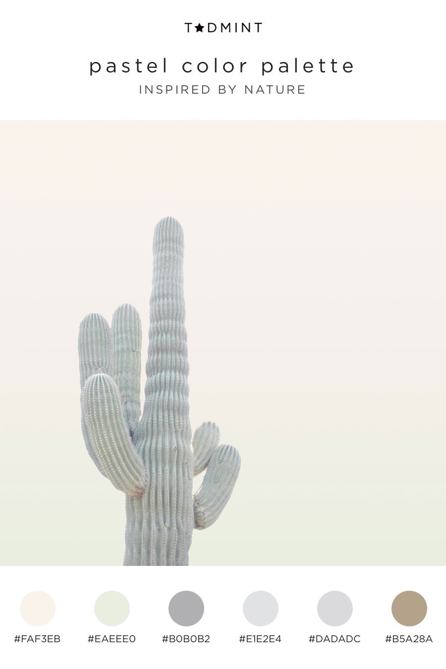
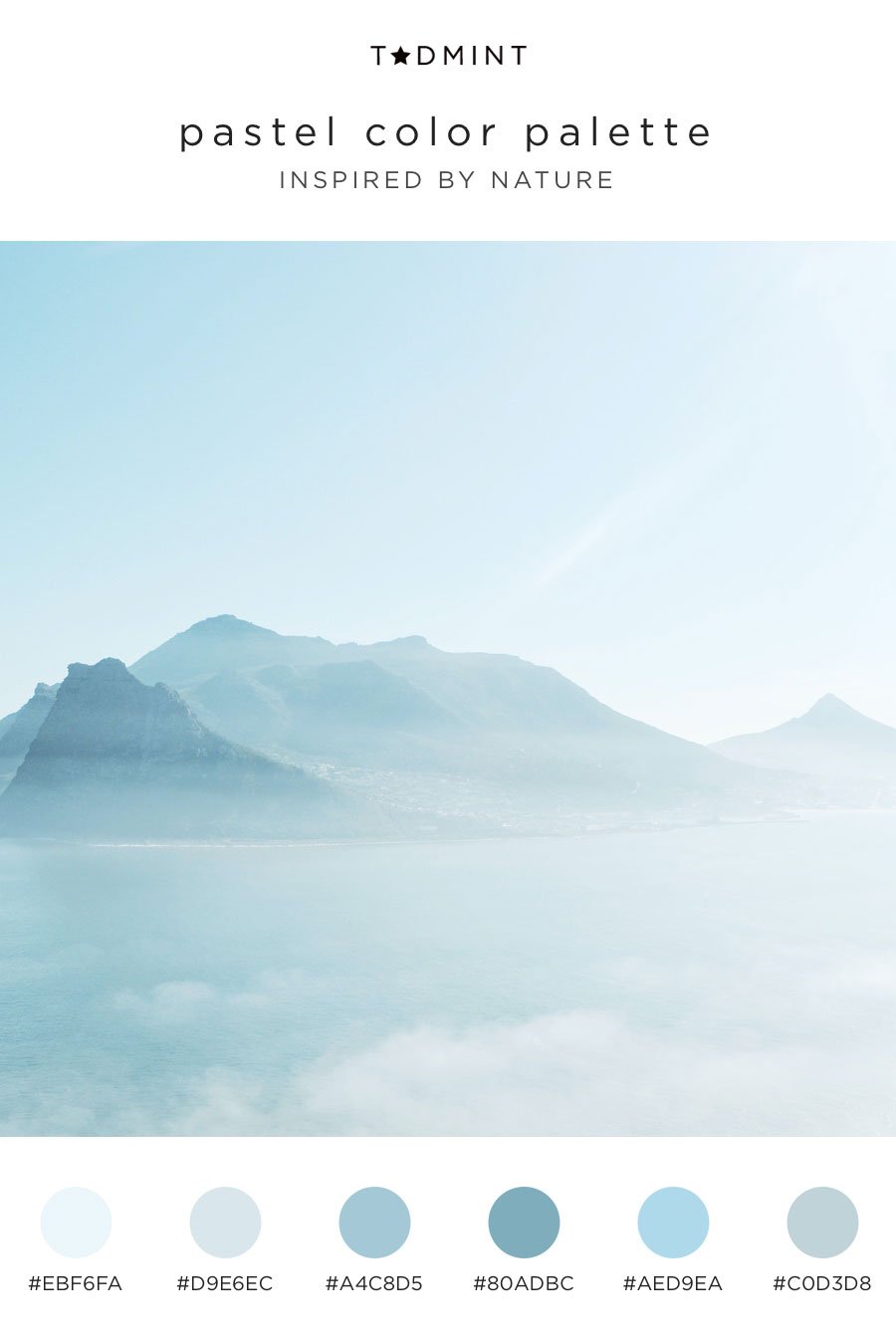
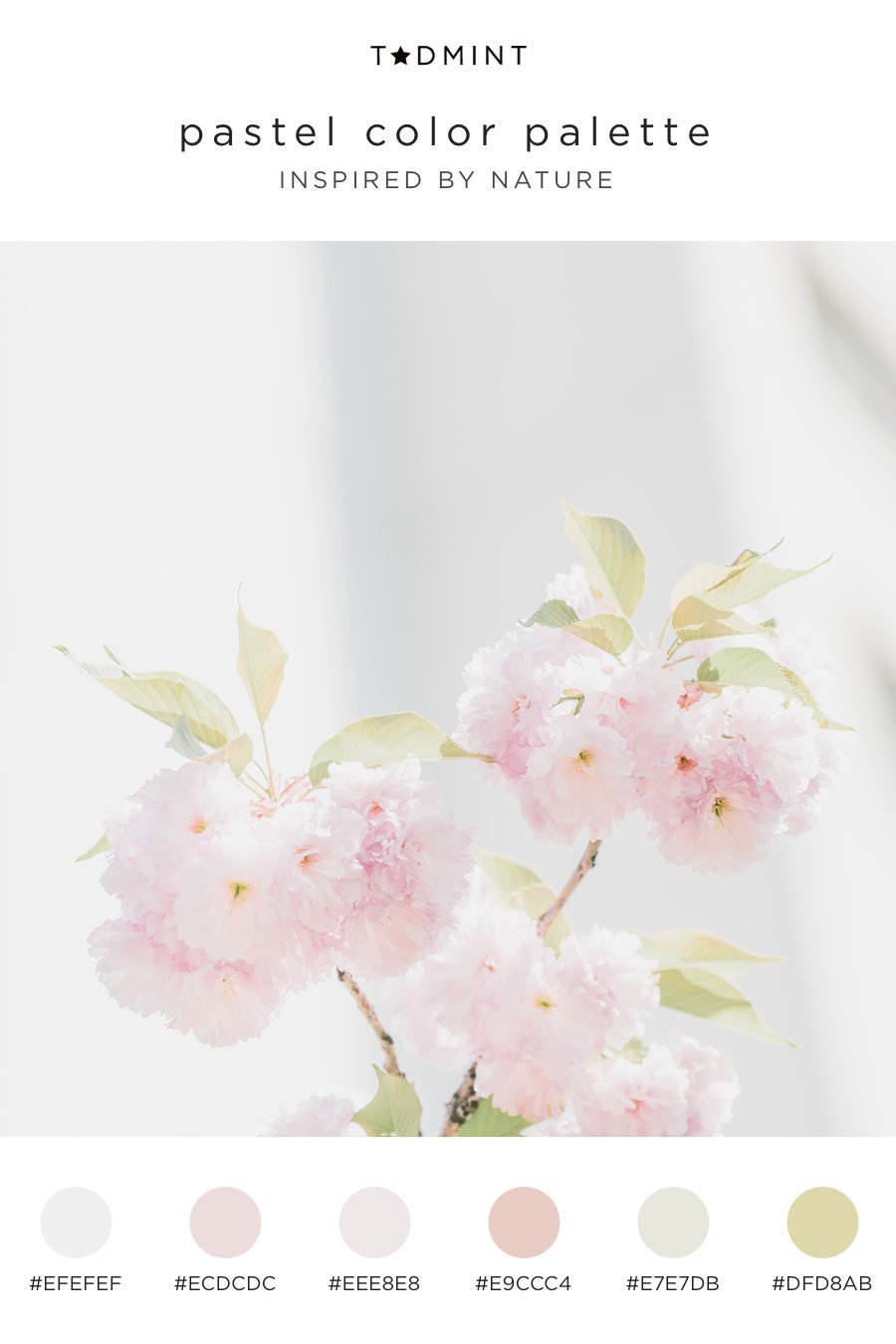
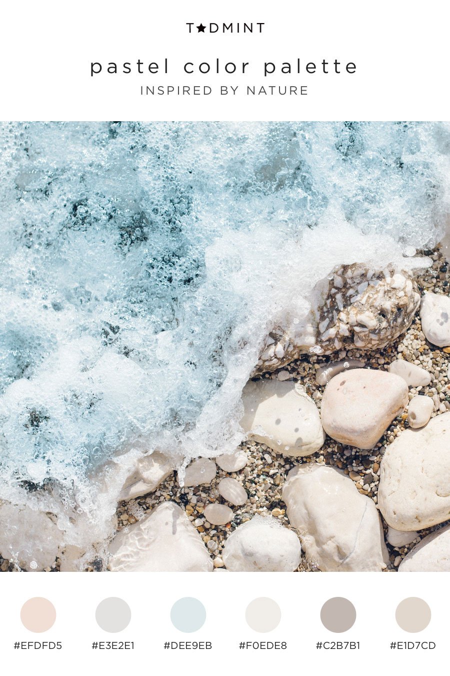
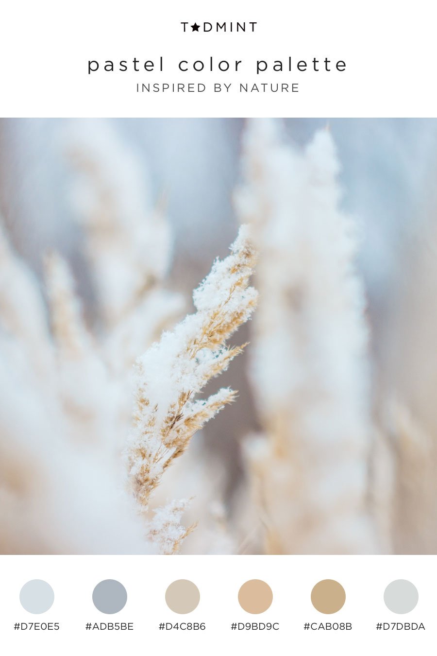
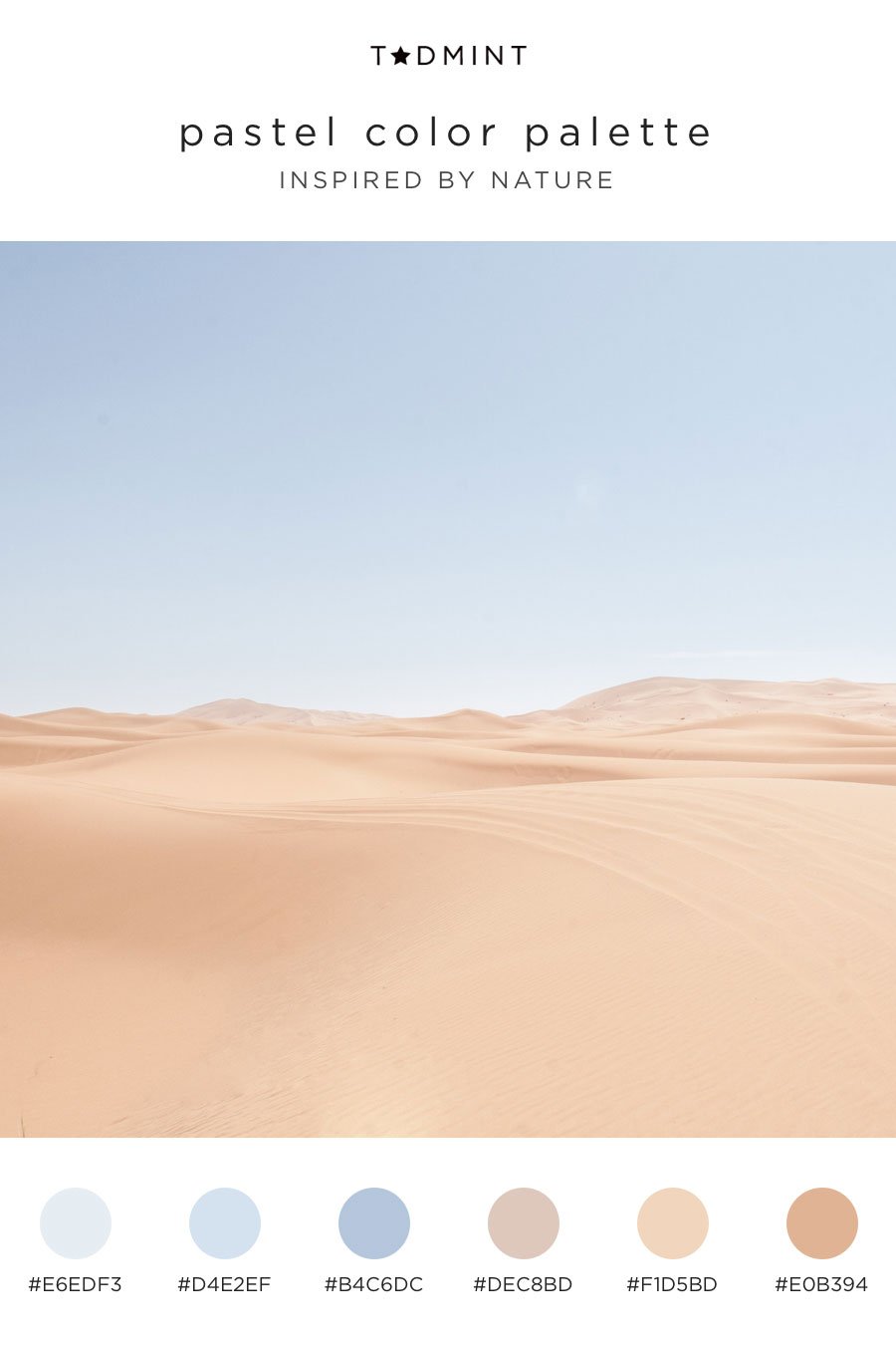
Nature always seems to know how to combine colors. And, when it comes to pastel colors, nature is on point! So, without further ado, here are eight pastel color palettes to inspire you. Use these color combinations for your next creative project. Included are hex codes in each of these too. Photo credit to the generous contributors at Unsplash. Finally, before I let you go, thank you for reading this article. Share away!
