13 Design System Examples
In this article are thirteen design system examples you can use to inspire you, and to help you learn more about the methodology behind creating one.
What is a design system?
A design system is a single source of truth — an organized resource where reusable UI components, code snippets and clear guidelines come together. Some companies create their digital systems as websites, while others use platforms such as Invision or Figma.
Why are design systems important?
Back in the day, websites were these easy breezy user interfaces anyone could build. All you had to know was a bit of HTML code and voila — website up and running!
Now, websites are complex digital experiences. If your website takes even 1 second too long to load (yes — 1 second!), research shows you can expect to incur these costs:
16% decrease in customer satisfaction
11% fewer page views
7% loss in conversions
Amazon says it would lose $1.6 billion in sales in a year if its website took even one second too long to load!
With the increasing complexity of websites, companies are having to instill formal ways of keeping everything organized so that their teams can more efficiently and consistently build high-quality user interfaces.
What are the benefits of having a design system?
Imagine a filing cabinet full of documents. None of them are in a manila folder. They’re all tossed in there just loosy goosy with no level of organization. Notes are hand scribbled everywhere. There are even some sticky notes thrown in, just to add to the chaos. How long would it take you to find the information you need?
Now imagine a filing cabinet where everything is perfectly filed away. Documents are in manila folders, neatly labeled with one of those Dymo labels, everything is typed, and someone even took the time to color code certain pages with sticky notes. Hello, efficiency!
Design systems are that beautiful OCD filing cabinet scenario. Not only are they totally satisfying because who doesn’t like things that are color coded, they are great because they save teams time and money while maintaining brand consistency.
According to Figma, designers that have access to a design system can crank through projects 34% faster than those without a design system. That amount of time savings is super valuable, especially when you consider that as designers, we continuously live on deadlines.
Now that we know a bit more about design systems and what makes them important, let’s take a look at some examples to learn more about them. If you’re interested in learning more about design systems from the pros, check out this video from UX Speakeasy. This panel of UX and product designers from companies such as IBM, Roku, and Intuit offers some really good insight into design systems.
A collection of thirteen design system examples
The following are the two design systems I reference the most. Their usage guidance is detailed, thorough, and rich with component and pattern documentation.
Carbon Design System by IBM
IBM’s open-source design system is one of the most comprehensive design systems, with loads of documentation and best practices. Based on the UX Speakeasy video which I shared with you earlier, you’ll come to learn that the team that is currently building this system is comprised of around 30 designers.
Bonus: One major bonus about the Carbon Design System is that they generously share their Sketch library. Having access to all of their building blocks in Sketch without having to create everything from scratch is huge. Thank you, team at IBM!
Material Design by Google
Along with Carbon Design System, Material Design is equally as unparalleled. Basically, it has everything. In the components section, there are tons of nice graphics that help illustrate information in a very clear manner. This is really a go-to design system when you’re looking for one to reference.
This next set of design systems is also a great source of information. Any design system that can provide rationale and examples is super helpful. The government-related design systems tend to have more information with regard to accessibility, which is nice. This can come in handy if you need help creating guidelines with that in mind.
Material is an adaptable system of guidelines, components, and tools that support the best practices of user interface design.
BBC Gel
BBC GEL is the BBC’s design framework. It was also one of the very first design frameworks to be published online back in 2010.
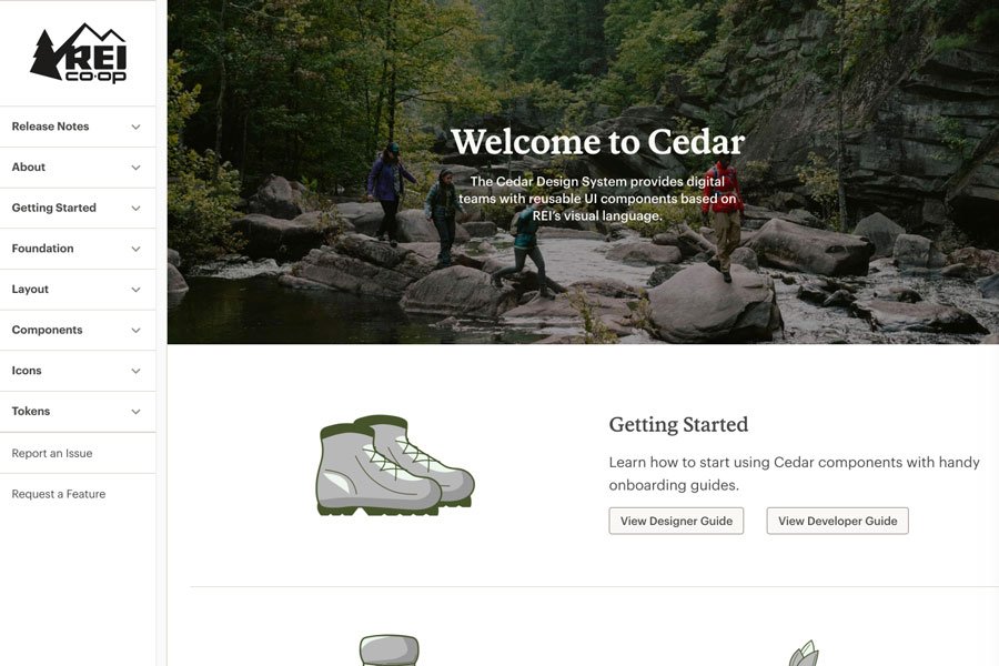
Cedar by REI
The Cedar Design System provides REI’s digital teams with reusable UI components based on their visual language.
Uber
Get access to Uber’s Base design system in Figma.
Nasa
NASA’s design system is no longer maintained, but still worth considering as a reference point.
Solid by Buzzfeed
Solid is Buzzfeed’s CSS style guide.
GOV.UK
Use the GOV.UK design system to create a service using styles, components and patterns researched by other service teams.
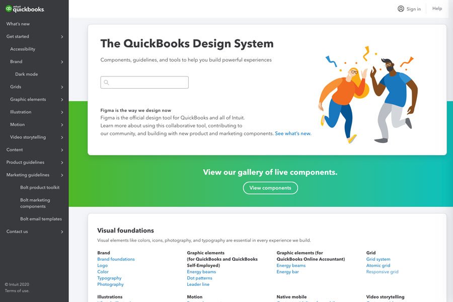
Quickbooks by Intuit
The QuickBooks design system contains components, guidelines, and tools to help build experiences that create an impact. Figma is the official design tool for all of Intuit.
Atlassian
Use Atlassian’s end-to-end design language to create simple, intuitive, and beautiful experiences.
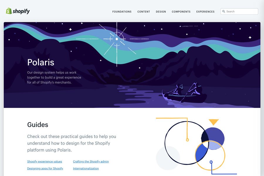
Polaris by Shopify
The Polaris design system helps their team work together to build a great experience for all of Shopify’s merchants.
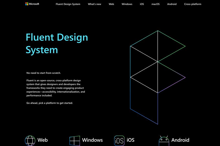
Fluent by Microsoft
Fluent is an open-source, cross-platform design system that gives designers and developers the frameworks they need to create engaging product experiences.
Protocol for Mozilla and Firefox
Protocol is a design system for Mozilla and Firefox websites.
And if you need even more inspiration or points of reference, check out this website I stumbled upon recently from Design Systems Repo. It’s a comprehensive and curated list of design systems.
Wrapping Up
Creating a design system requires thought and strategy. To learn more, read about the process of how Airbnb and Figma created theirs. If you do decide to create a design system, the payoff will be tremendous. Your team will be able to build applications and websites faster and more consistently by using design components and code.


